Color
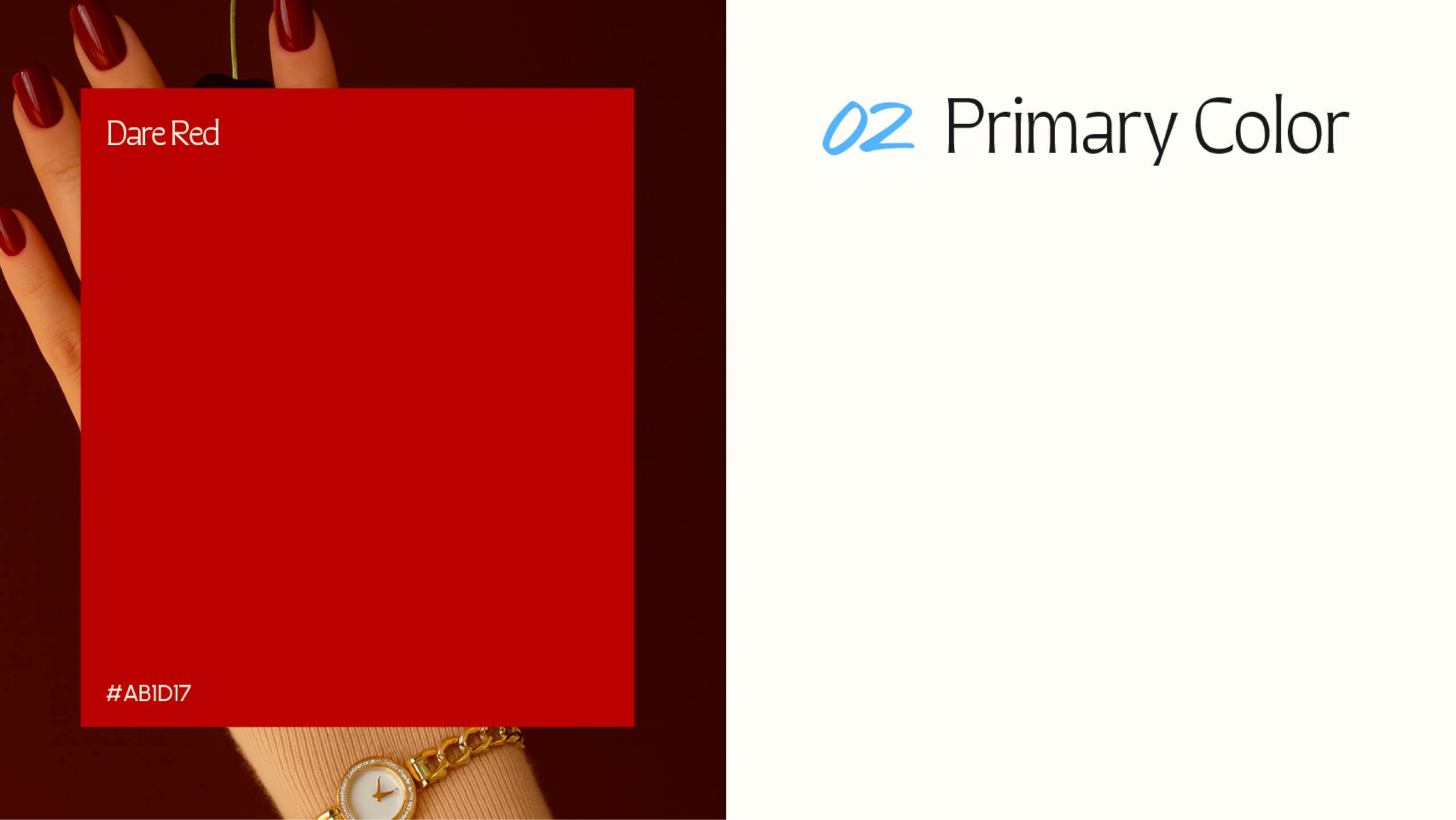
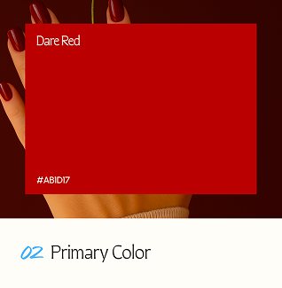
Primary Color
This red is used as an accent to represent Isabel Van Brugen’s sharp intelligence and unflinching curiosity. Bold yet refined, it cuts through neutrality to spotlight key moments — much like Isabel’s voice. This red is not loud, but deliberately focused — used to draw attention where it matters, when the question goes deeper.
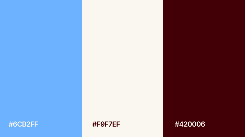
Secondary Color
This color system balances warmth, clarity, and control. The sky blue acts as a visual regulator, tempering the intensity of the reds and allowing the entire palette to breathe. It introduces calm, neutrality, and clarity—creating space for tension without overwhelming the composition. The maroon brings grounded authority and editorial weight, while the light beige softens the tone with an open, human glow — evoking intimacy and light.

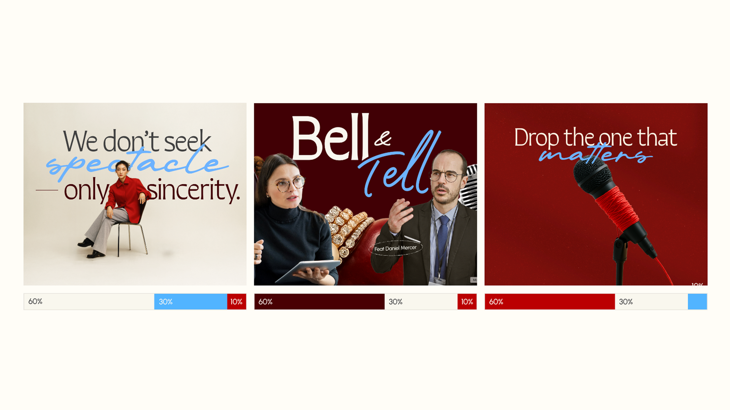
Color Pairing
This guide establishes a consistent approach to applying the brand palette using a 60:30:10 ratio—where each layout features a clear hierarchy of tone and contrast. In every pairing, Dare Red must be present, whether it leads (60%), supports (30%), or highlights (10%). As the brand’s core accent, Dare Red brings energy, edge, and recognition to any composition.